library(conflicted)
library(tidyverse)
conflict_prefer_all("dplyr", quiet = TRUE)
conflict_prefer("as_date", "lubridate")
library(scales)
library(ggfx)
library(patchwork)
library(wesanderson)
library(clock)
library(tidyquant)Painting Tails
R
special effects
If you’re a cat, go find the nearest open pot of paint. But if you’re a data scientist, what to do?

There are techniques for painting a region under a curve. But the experimental ggfx package offers an interesting alternative solution based on the blending modes familiar to users of Photoshop.

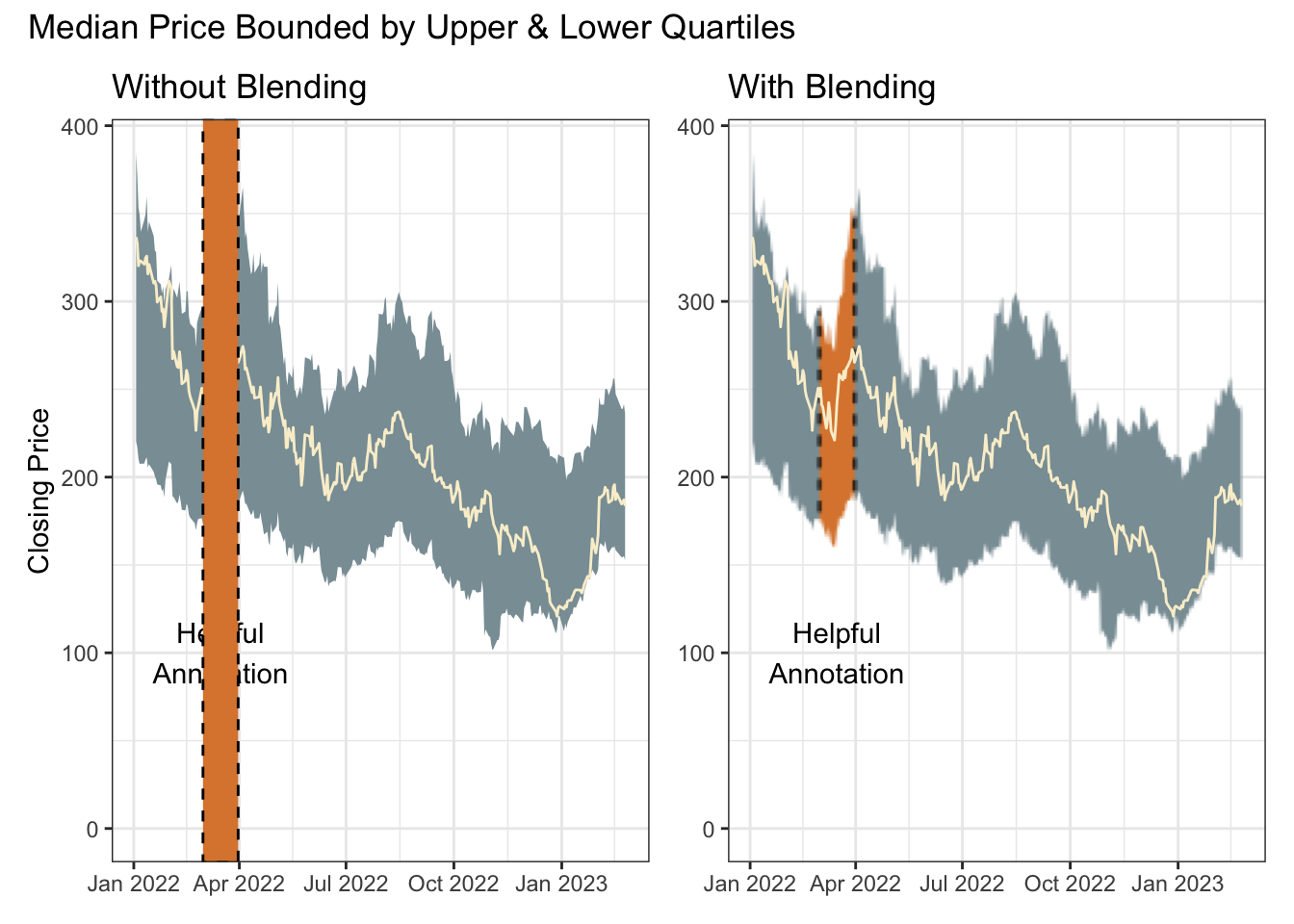
The advantage here is that the tail-painting aesthetic needs no information about the shape of the curve; only the limits on the x-axis.
The left plot shows the raw components without blending. The right plot is only retaining the red where there is a layer below.
p0 <- tibble(outcome = rnorm(10000, 20, 2)) |>
  ggplot(aes(outcome)) +
  scale_y_continuous(labels = label_percent())

p1 <- p0 +
  geom_density(adjust = 2, fill = cols[3]) +
  annotate("rect",
    xmin = 15, xmax = 18, ymin = -Inf, ymax = Inf,
    fill = cols[2]
  ) +
  labs(title = "Without Blending", y = "Density")

p2 <- p0 +
  as_reference(geom_density(adjust = 2, fill = cols[3]), id = "density") +
  with_blend(annotate("rect",
    xmin = 15, xmax = 18, ymin = -Inf, ymax = Inf,
    fill = cols[2]
  ), bg_layer = "density", blend_type = "atop") +
  labs(title = "With Blending", y = NULL)

p1 + p2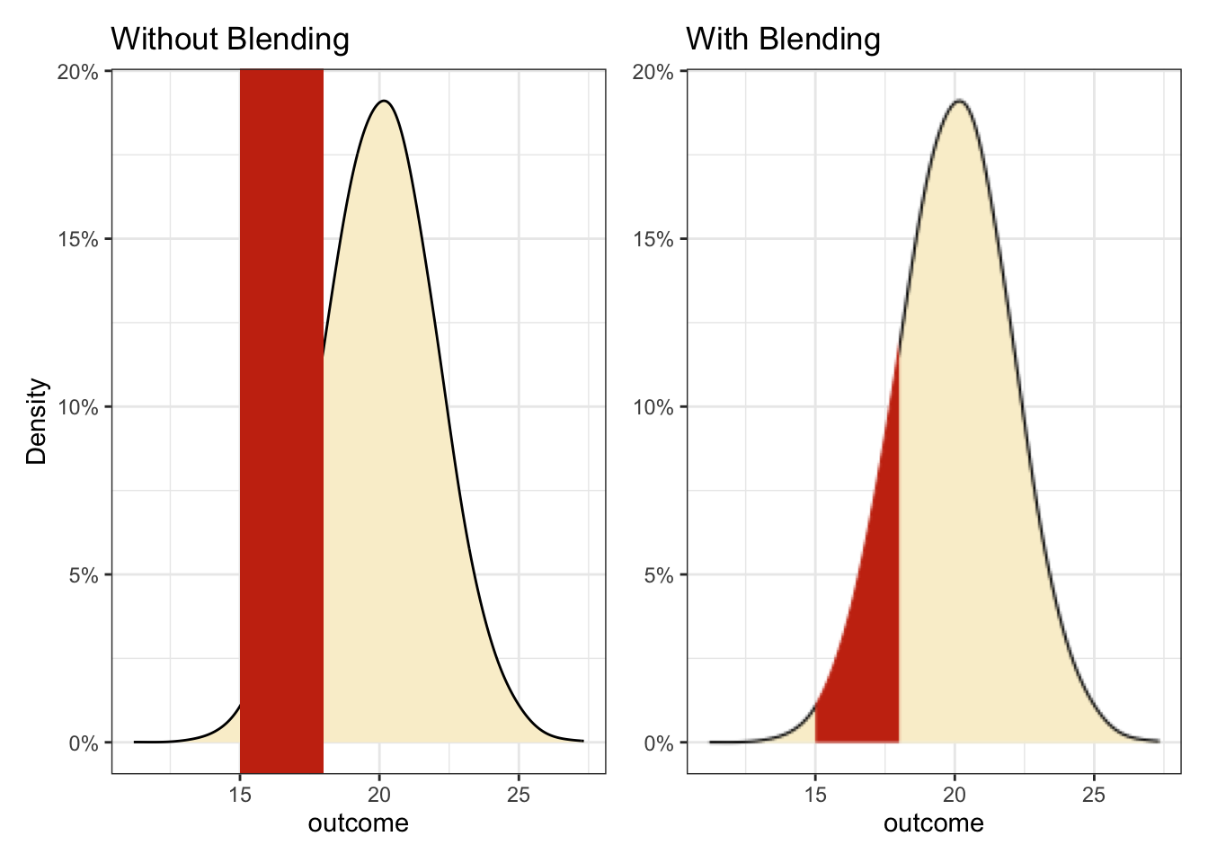
Of course the red box could also be layered behind a density curve with alpha applied so it shows through. But if the preference is tail-only colouring, it’s a neat solution.
Blending is actually a handy solution for any awkward shape. The same technique is used here with a time series ribbon summarising the median, lower and upper quartiles of a set of closing stock prices.
Note
Try this patch if having problems with tq_get
This chunk is using the development version of dplyr which introduces temporary grouping with .by.
tickrs <- c("AAPL", "NFLX", "TSLA", "ADBE", "META", "GOOG", "MSFT")

p0 <- tq_get(tickrs, get = "stock.prices", from = "2022-01-01") |>
  filter(!is.na(close)) |>
  reframe(
    close = quantile(close, c(0.25, 0.5, 0.75)),
    quantile = c("lower", "median", "upper") |> factor(),
    .by = date
  ) |>
  pivot_wider(names_from = quantile, values_from = close) |>
  ggplot(aes(date, median)) +
  annotate("text",
    x = ymd("2022-03-16"), y = 100,
    label = "Helpful\nAnnotation", colour = "black"
  ) +
  scale_y_continuous(limits = c(0, NA)) +
  labs(x = NULL)

p1 <- p0 +
  geom_ribbon(aes(ymin = lower, ymax = upper), fill = cols[1]) +
  geom_line(colour = cols[3]) +
  annotate("rect",
    xmin = ymd("2022-03-01"), xmax = ymd("2022-03-31"),
    ymin = -Inf, ymax = Inf,
    fill = cols[4], colour = "black", linetype = "dashed"
  ) +
  labs(title = "Without Blending", y = "Closing Price")

p2 <- p0 +
  as_reference(geom_ribbon(aes(ymin = lower, ymax = upper),
                           fill = cols[1]), id = "ribbon") +
  with_blend(
    annotate(
      "rect",
      xmin = ymd("2022-03-01"), xmax = ymd("2022-03-31"),
      ymin = -Inf, ymax = Inf,
      fill = cols[4], colour = "black", linetype = "dashed"
      ),
    bg_layer = "ribbon", blend_type = "atop"
    ) +
  geom_line(colour = cols[3]) +
  labs(title = "With Blending", y = NULL)

p1 + p2 +
  plot_annotation(title = "Median Price Bounded by Upper & Lower Quartiles")