The Goldilocks Principle

The Goldilocks principle has its origins in a children’s story about a girl who tastes the bowls of porridge left by three bears. She prefers the one that is neither too hot nor too cold, but is just right.
When it comes to investing in stocks, how many is ‘just right’?
Too few and the fortunes of individual stocks can dominate the result. Add more and those stock-specific surprises increasingly cancel one another out. But diversification has a cost if it means moving further down a ranked list of investment ideas.
Theme & palette
theme_set(theme_bw())

pal_name <- "wesanderson::Darjeeling2"

pal <- paletteer_d(pal_name)

display_palette(pal, pal_name)
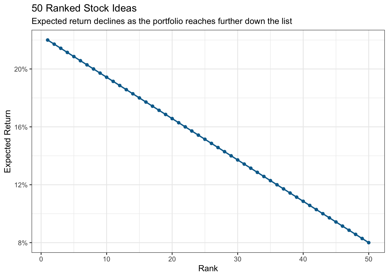
Suppose some extensive research — or perhaps a cool machine learning model — produces 50 candidate stocks ranked from strongest to weakest. To keep things deliberately artificial, I’ll give the highest-ranked stock an expected return of 22%, declining gradually to 8% for the fiftieth.
These numbers are deliberately artificial. I assume the ranking is informative: higher-ranked stocks really do have higher expected returns. Each portfolio holds its stocks in equal proportions, with independent stock-specific shocks and a market shock shared by every holding.
Ranked returns
stock_data |>
  ggplot(aes(rank, expected_return)) +
  geom_line(colour = pal[2], linewidth = 0.8) +
  geom_point(colour = pal[2], size = 1.5) +
  scale_y_continuous(labels = label_percent()) +
  labs(
    title = "50 Ranked Stock Ideas",
    subtitle = "Expected return declines as the portfolio reaches further down the list",
    x = "Rank",
    y = "Expected Return"
  )
Now for the uncertain bit. A stock’s eventual return can be thought of, very simply, as containing a market-wide component and a stock-specific component.
Diversification can progressively suppress the second, but not the first. So I’ll simulate 5,000 possible outcomes for portfolios containing the top 2, 5, 10, 20 or all 50 stocks.
The numbers are deliberately schematic — this is a thought experiment rather than an investment model.
n_sims <- 5000
market_sd <- 0.08
stock_sd <- 0.25

portfolio_sizes <- c(2, 5, 10, 20, 50)

simulate_portfolio <- \(n, sims = n_sims) {
  tibble(
    portfolio_size = n,
    portfolio_return = mean(stock_data$expected_return[seq_len(n)]) +
      rnorm(sims, 0, market_sd) +
      rnorm(sims, 0, stock_sd / sqrt(n))
  )
}

set.seed(456)

portfolios <-
  map(portfolio_sizes, simulate_portfolio) |>
  list_rbind() |>
  mutate(
    portfolio_size = factor(
      portfolio_size,
      levels = portfolio_sizes
    )
  )

portfolio_summary <- portfolios |>
  summarise(
    mean_return = mean(portfolio_return),
    p05 = quantile(portfolio_return, 0.05),
    .by = portfolio_size
  )
Simulated outcomes
bowls <- portfolios |>
  summarise(return_sd = sd(portfolio_return), .by = portfolio_size) |>
  left_join(portfolio_summary, by = join_by(portfolio_size)) |>
  mutate(
    # Illustrative steam bands; fill remains continuous.
    bowl = case_when(
      return_sd > 0.13 ~ "bowl2",
      return_sd > 0.095 ~ "bowl1",
      TRUE ~ "bowl0"
    )
  )

portfolios |>
  ggplot(aes(portfolio_size, portfolio_return, group = portfolio_size)) +
  geom_violin(fill = NA, colour = "grey55", linewidth = 0.5) +
  geom_casting(
    aes(y = mean_return, shape = bowl, fill = return_sd),
    data = bowls,
    colour = "grey20",
    size = 0.18,
    vjust = 0.36
  ) +
  geom_point(
    aes(y = p05),
    data = portfolio_summary,
    fill = pal[1],
    colour = "grey20",
    shape = 21,
    size = 3
  ) +
  geom_label(
    aes(y = mean_return, label = percent(mean_return, accuracy = 0.1)),
    data = portfolio_summary,
    nudge_y = 0.22,
    fill = "white",
    size = 3
  ) +
  geom_label(
    aes(y = p05, label = percent(p05, accuracy = 0.1)),
    data = portfolio_summary,
    nudge_y = -0.1,
    fill = "white",
    size = 3
  ) +
  scale_shape_identity() +
  scale_fill_viridis_c(
    option = "plasma",
    begin = 0.08,
    end = 0.92,
    name = "Return SD",
    labels = label_percent(accuracy = 0.1)
  ) +
  scale_y_continuous(
    labels = label_percent(),
    breaks = breaks_extended(8)
  ) +
  labs(
    title = "The Goldilocks Trade-off",
    subtitle = glue(
      "Mean and 5th-percentile return across {label_comma()(n_sims)} simulated outcomes"
    ),
    x = "Number of Stocks",
    y = "Portfolio Return",
    caption = "Bowls: mean return · Dots: 5th percentile\nHotter colours indicate greater variability; steam counts use illustrative bands."
  ) +
  theme(
    legend.position = "none",
    panel.grid.minor = element_blank(),
    plot.caption = element_text(hjust = 0)
  )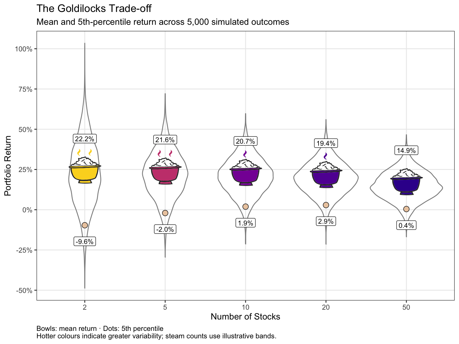
Bowls show mean returns and lower dots show fifth percentiles with 5% of simulated outcomes falling below them. Hotter colours indicate greater return variability. The steam counts are illustrative, rather than investment thresholds. Of the five portfolio sizes tested, 20 stocks has the highest fifth-percentile return under these assumptions.
And there’s Goldilocks.
With only a couple of stocks, the highest-conviction ideas dominate the portfolio — but so does stock-specific risk. Adding stocks initially makes a substantial difference because those individual surprises increasingly cancel one another out.
Eventually the benefit diminishes. Market-wide uncertainty remains, while every additional holding reaches further down the ranked list and dilutes its expected return.
Under these particular assumptions, an intermediate portfolio therefore offers the more attractive downside trade-off. Change the assumptions and the ‘just right’ number will change too — which is rather the point.
Goldilocks isn’t a number. It’s a trade-off.
R Toolbox
Summarising below the packages and functions used in this post enables me to separately create a toolbox visualisation summarising the usage of packages and functions across all posts.
| Package | Function |
|---|---|
| base | c[1], factor[1], library[7], mean[2], seq[1], seq_len[1], set.seed[1], sprintf[1], sqrt[1] |
| conflicted | conflict_prefer_all[1], conflict_scout[1] |
| dplyr | case_when[1], join_by[1], left_join[1], mutate[2], summarise[2] |
| ggfoundry | display_palette[1], geom_casting[1] |
| ggplot2 | aes[6], element_blank[1], element_text[1], geom_label[2], geom_line[1], geom_point[2], geom_violin[1], ggplot[2], labs[2], scale_fill_viridis_c[1], scale_shape_identity[1], scale_y_continuous[2], theme[1], theme_bw[1], theme_set[1] |
| glue | glue[1] |
| paletteer | paletteer_d[1] |
| purrr | list_rbind[1], map[1] |
| scales | breaks_extended[1], label_comma[1], label_percent[3], percent[2] |
| stats | quantile[1], rnorm[2], sd[1] |
| tibble | tibble[2] |
| usedthese | used_here[1] |